Have you been outside lately? You know how you are seeing more people
using tablets and smartphones? Well, it’s not a trend as much as the
norm any more. Walking around, we are plugged in to our mobile device.
At some restaurants, the waiter or waitress takes our order. Mobile is
ubiquitous. So why, why, why are there still so many businesses that
have not yet adapted? I don’t know, and the good news is that you have a
way to take advantage of the new reality.
As smartphones and tablets are ever more capable of performing tasks
that used to be only capable on desktop, one thing is crystal clear:
Internet surfing, connecting on social media, checking emails and online
shopping is being taken over by mobile.
Naturally, because mobile Internet usage is steadily increasing, you
can see that it’s extremely important that your website is mobile
friendly. In the past, you had a website designed for desktop users and
another site specifically developed for mobile users. But, now we need a
website optimized for desktop, tablet and, mobile. Are you really gonna
build multiple unique sites to accommodate the various screen sizes?
There actually is a method to satisfy many types of users. It’s
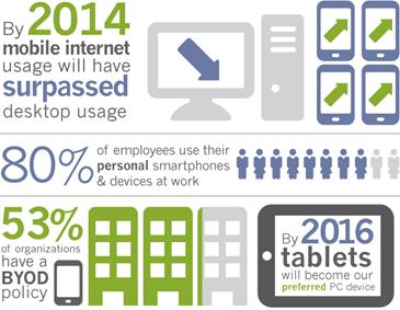
called responsive web design. According to a report by Morgan Stanley,
Mobile Devices will overtake Desktop usage this year. 2013 may have been
hailed as “The Year of Responsive Design”, but RWD is far from last
year’s news. Put simply, having responsive design means a website
adjusts depending on which device they are being displayed on, ensuring
that whether the content is viewed on a phone, tablet, or desktop
computer, the website will remain user-friendly, which is ultimately the
most important feature of any website or blog. So as though you really
needed them, here are the Top 12 Reasons to convert to Responsive Web
Design.
1. Recommended By Google
Since Google is the primary search engine to impress with your
website, it is smart to follow what Google loves. Google not only
recommends Responsive Web Design (RWD) as the best way to target mobile
and tablet users, and also favors mobile-optimized sites when presenting
results for searches made on a mobile device. This is especially true
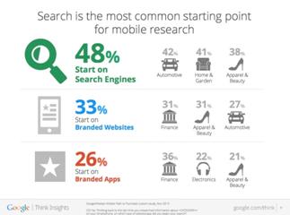
when mobile users search for local services. It’s important to note more
searches are originated on mobile devices.
Of course there is still debate whether a separate mobile website or a
single, responsive site is the best route to take. From an SEO
perspective, a single site is the better option (More on this later).
Separate mobile websites have their own URL and different code, whereas
responsive sites use one URL and one set of pages and files, making it
simpler for Google more efficient for Google to crawl, index, and
organize content and avoids issues of duplicate content.
With 67 percent search market share, when Google speaks, search
marketing professionals listen. Google now states that responsive web
design is the
industry best practice.
When you think about it, it’s also easier and less confusing for
users to share, interact with, and link to than content on a stripped
down mobile site.
For instance, a mobile user who shares content from a mobile site
with a friend on the Facebook app who then accesses that content using a
desktop, which results in that user viewing a stripped down mobile site
on their desktop. This creates a less than optimal user-experience, and
because of the large emphasis Google is now placing on user-experience
as a ranking factor, this is essential to take into account with regards
to SEO.
2. One Website, Multiple Devices
Providing a great user-experience across multiple devices and screen
sizes is the most appealing and most critical aspects of responsive web
design for today’s uber mobile world. Take the following example. I
search for a birthday gift on my smartphone during a break at work. I
then continue researching this product on the same site on my MAC when I
get home.
Because the site is responsive, won’t be frustrated with the extra
steps to locate the desktop version of the site, and find the product
all over again.
3. Easier to Manage
Having a separate desktop and mobile site requires having separate
Google Adwords campaigns, SEO campaigns and separate Google Analytics
reports. Managing one site is of course, far easier than managing two
sites.
There can be an argument made for multiple sites though, such as
having a mobile-specific Adwards and SEO strategy, such as optimizing
for keywords that are more likely to be searched when someone is on
their smartphone.
4. Positive User Experience Is Key
If a user lands on your mobile website and is frustrated or doesn’t see what they are looking for, according to
Google’s Think Insights
on Mobile, there’s a 61% chance they will leave and go to a different
website. Data shows a positive experience with your responsive website a
user is 67% more likely to buy a product or use a service.
5. Blogging and Social Activities Bring Mobile Visitors
If you’re like most smart Inbound Marketers and incorporate blogging
and social media in your strategy, you have most likely been seeing
increased mobile traffic. A recent study by ComScore cites that 55% of
social media consumption happens on a mobile device. SHOCKER!
6. Responsive Design is Preferred for SEO
Typically, Responsive Websites perform better and are easier to
maintain. One thing not mentioned above is that a challenge of having a
separate mobile site is that you will need to build the authority of
this site from scratch, and who wants to go to that extra trouble?
7. Responsive Helps Combat a High Bounce Rate
Even if your regular website is sitting pretty in search results, if
it looks and performs like crap on my tablet or smartphone, bounce rate
will be a big problem. Non responsive websites will suffer from a high
bounce rate if the content is too stripped down, or just plain clunky
and too challenging to work with compared to the content offered on the
main/desktop site. Google will naturally interpret this high bounce rate
as a sign that a website irrelevant, which will lead to your drop in
rankings, which is why we don’t see mobile versions of sites ranked
high.
RWD means that there is no more compromising on the content you choose to display!
8. A Speedy Responsive Website is Key
The content per page on a mobile or tablet device should load in
under 1 – 2 seconds according to the Google PageSpeed Developers
standards. I’m not sure how possible that is when loading a desktop
website on a mobile device. I haven’t timed it, and I can tell you that I
don’t wait long before I close the window.
9. Responsive Adapts to Future Devices
As alluded to earlier, the benefit of responsive design is that the
size of the template is designed based on screen size not device.
Obviously, regardless of what size screen someone is viewing your
website it will display properly for that screen size. Unless, there
will be a worldwide movement to standardize on one screen size,
responsive design is here to stay. Having a mobile website is no longer
just a nice feature or after thought. Fully functional websites for all
screen sizes are mission critical for the growth of your business.
What’s the ROI? check out is this “
Full Value of Mobile”
calculator by Google. Input your different business and marketing
variables to learn how your metrics can be increased with proper
responsive mobile design.
10. Responsive Design allows you to keep track of who visits your site
The great thing about online assets is that you can see who visits
them, which allows you to increasingly improve your targeting. It should
go without saying that with multiple versions of your site, it is more
challenging to track analytics. This is the same logic against multiple
business listings on various directories like Yelp, Manta, Merchant
Circle, Kudzu, etc. because traffic is diluted between the various
versions of your site. As a user, it can be extremely frustrating when
searching for a site and then needing to find the most current and
accurate site listed on the SERPs. Just sayin.
11. Responsive Design saves you money.
Have you ever heard the saying: You get what you pay for? There is a
reason that saying still lives today and applies to Responsive design.
Sure, a complicated, well crafted, responsive design could be expensive
to develop or implement (Unless you select one of the 1000 options
available for WordPress websites), but once published, you can maintain
it quite easily. This is much more economical to maintain one site
rather than multiple sites, wouldn’t you agree?
12. Responsive Design has Pay-Per-Click benefits.
Google AdWords has now converted the web to “enhanced campaigns”.
What this means for you is the targeting of various devices is the
treated the same. The benefit for you is that a website using Responsive
Design makes it a whole lot easier to manage your PPC. Businesses have
much more flexibility and control in how they reach consumers which are,
you guessed it, using more mobile devices. “Google’s enhanced campaigns
represent the biggest single change in the past 10 years to the basic
structure of AdWords campaigns,” says Larry Kim, founder and CTO of
WordStream.


